Adrian Frutiger
Designed the Univers and Frutiger typefaces, the latter engineered for legibility on airport signage at speed and distance.

Veronica's Take
Adrian Frutiger, the Swiss type design legend who passed away in 2015, transformed airport navigation with his Frutiger typeface, meticulously engineered for clarity at speed and distance. Before Frutiger, reading signs while rushing through terminals was a challenge; his relentless focus on every curve and gap, especially in lowercase letters, turned it into a precise and reliable experience. His work isn't just type; it's a quiet yet powerful triumph of design that guides millions of travelers every day.
He drew letters for people rushing through airports half-reading at a glance, and if you've ever found your gate without missing a step, thank a man who agonized over the gap in a lowercase e.
Key Facts
The people behind Adrian Frutiger
Adrian Frutiger
profileType Design — historical
Designed the Univers and Frutiger typefaces, the latter engineered for legibility on airport signage at speed and distance.
Browse by discipline
More masters worth your time

Thomas Edison
Developed the first commercially practical incandescent light bulb and the systems to power it, electrifying everyday life.
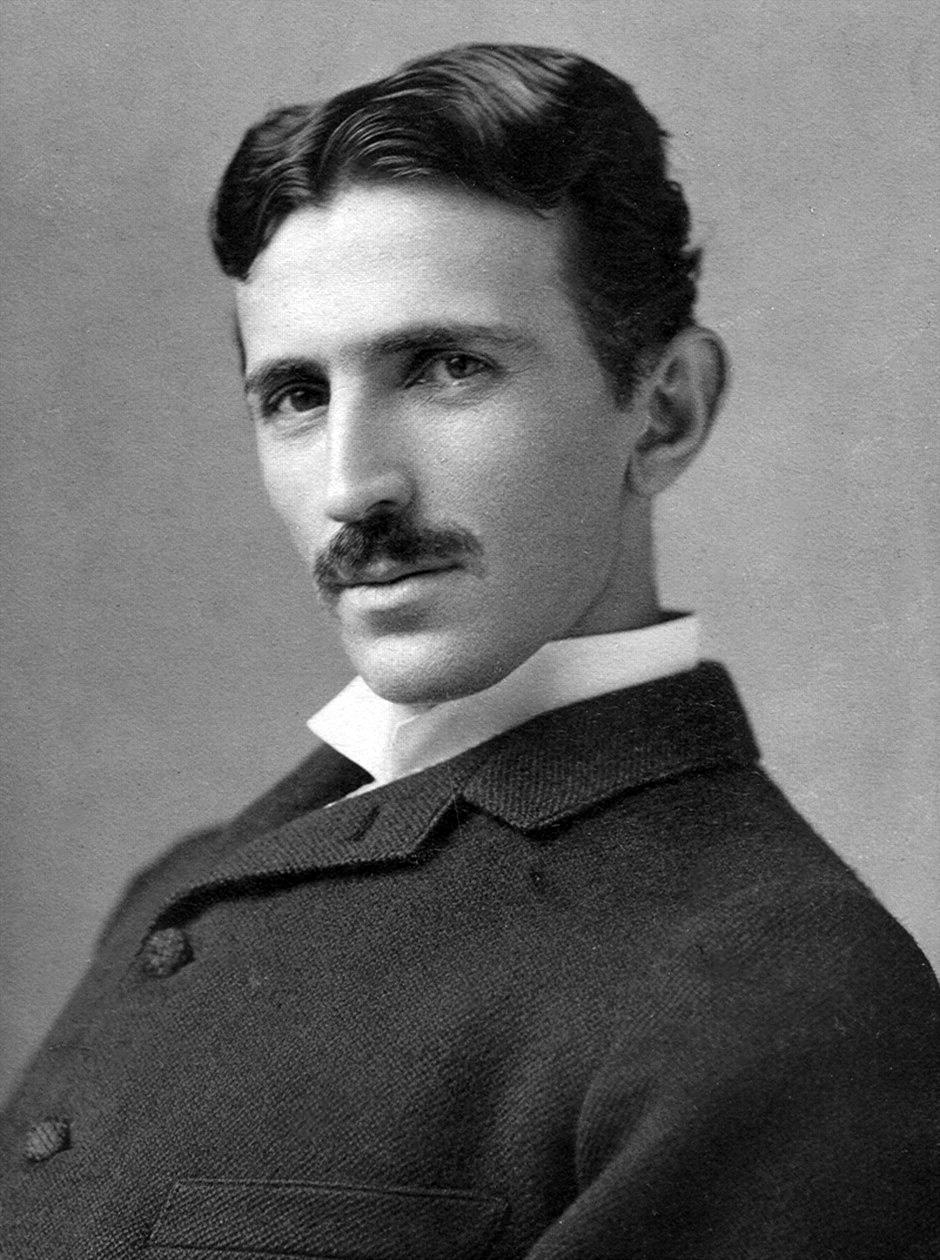
Nikola Tesla
Pioneered the alternating-current system that became the global standard for electrical power transmission.

Dieter Rams
Defined Braun's product language and codified the ten principles of good design that shaped modern industrial aesthetics.
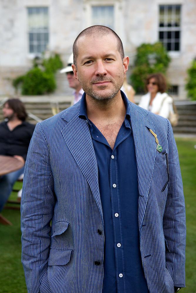
Jony Ive
Led the design of the iMac, iPod, and iPhone, making the seamless minimalist object the dominant form of consumer technology.
Want discoveries like this in your inbox every morning?
One master of craft. Every morning. Chosen by someone with actual standards and zero patience for the mediocre. Free forever, unsubscribe whenever.